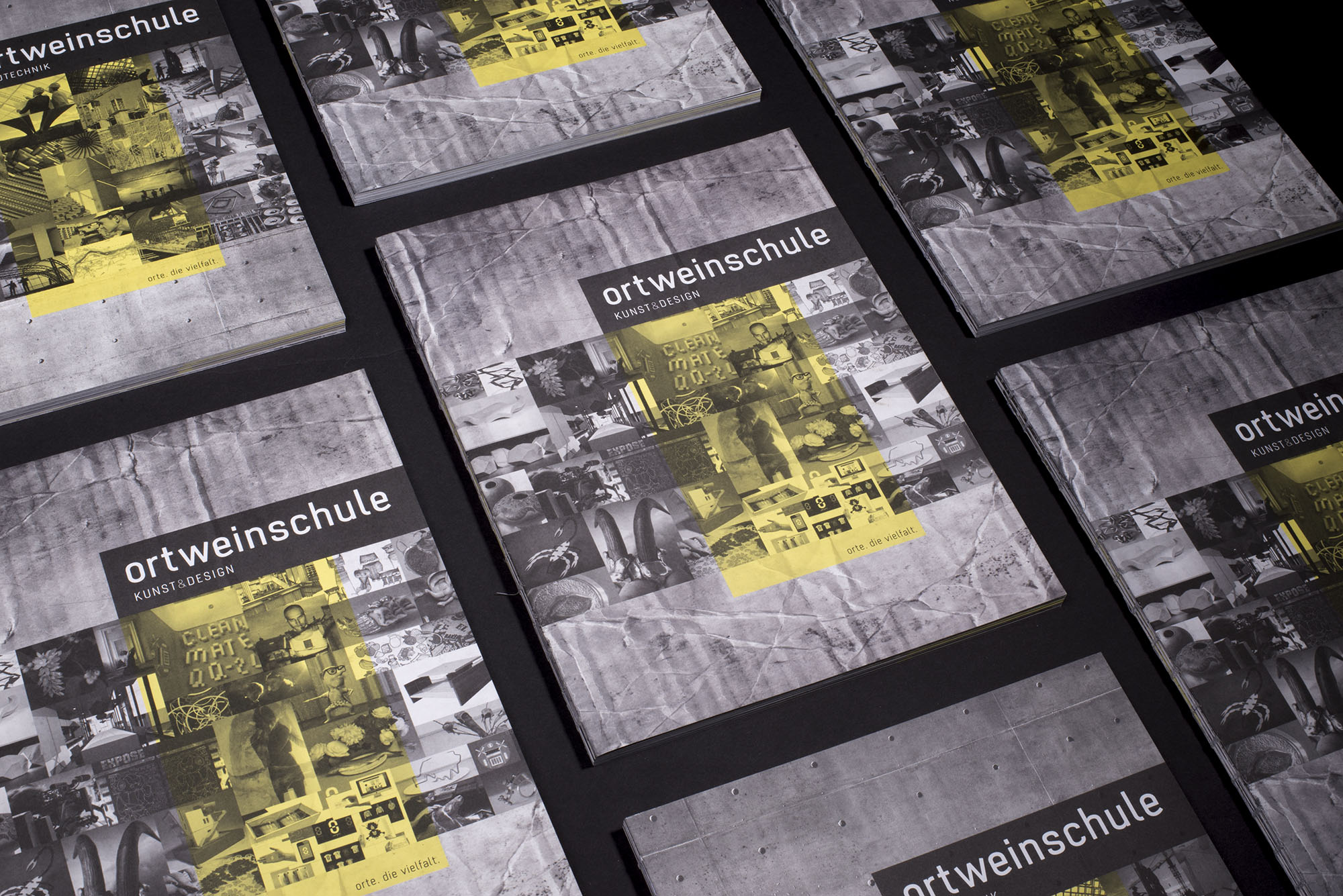
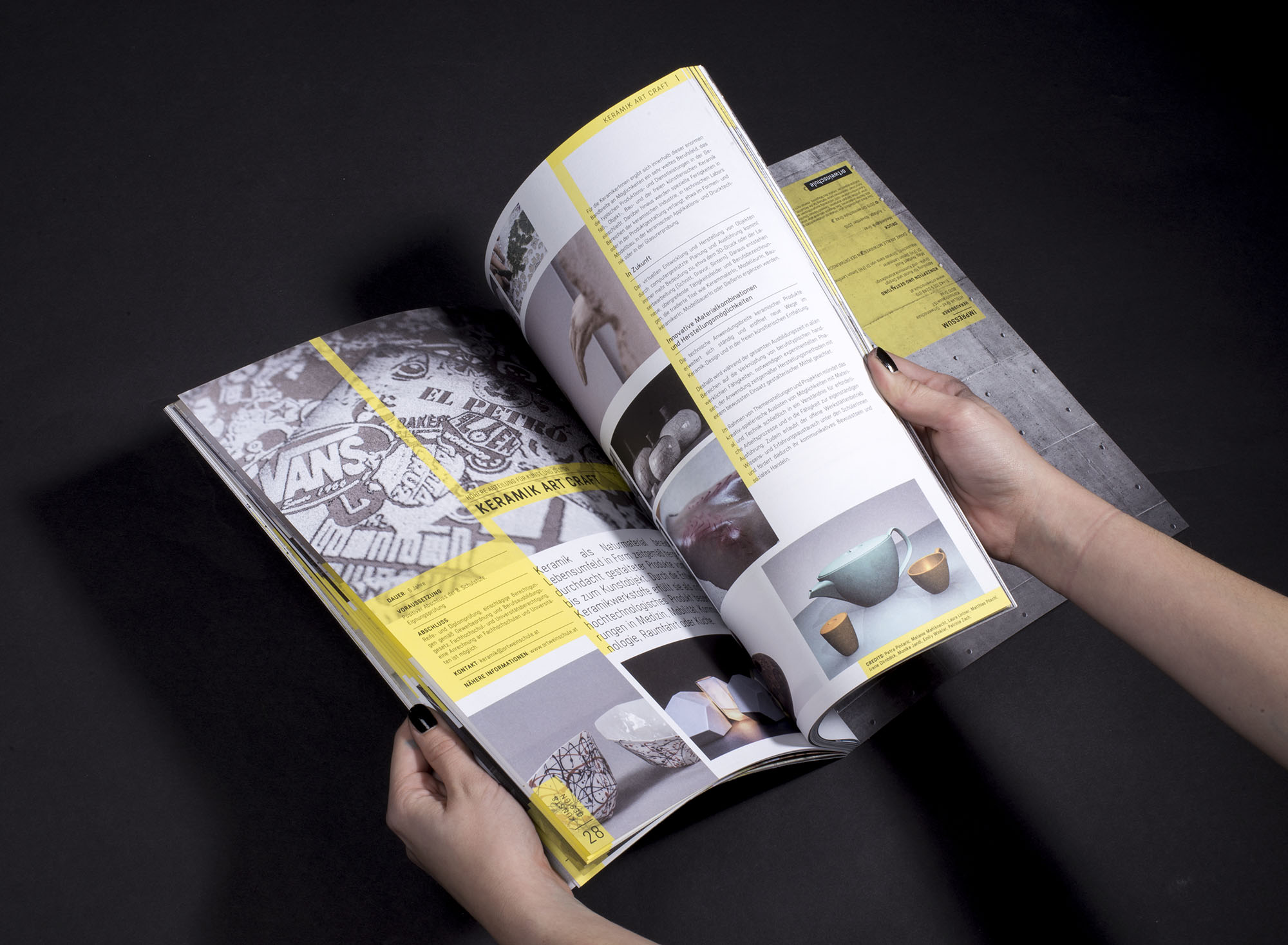
Stratos sans typeface
Design Date: started 2015, finished in 2017
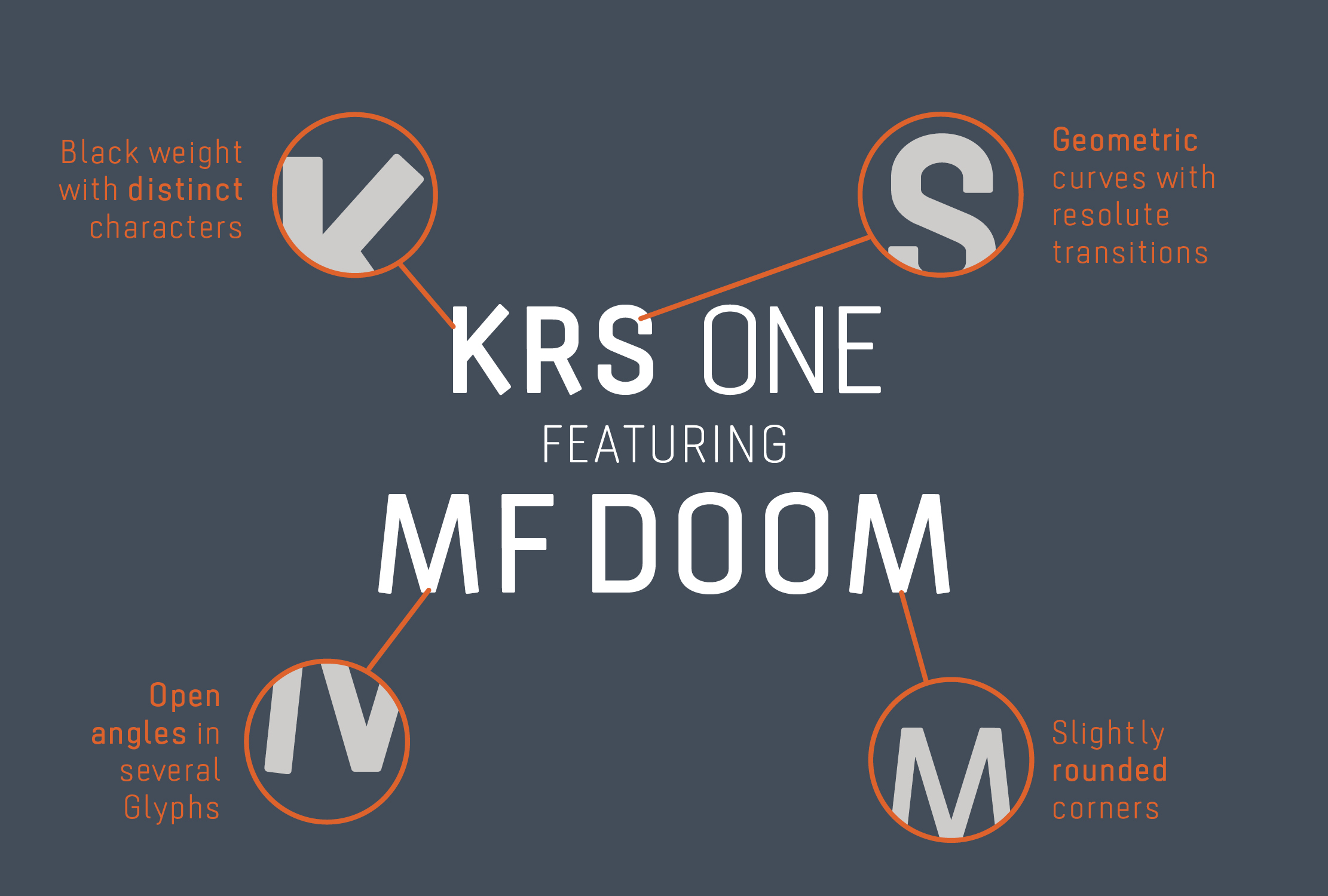
Stratos sans is inspired by geometric forms and the
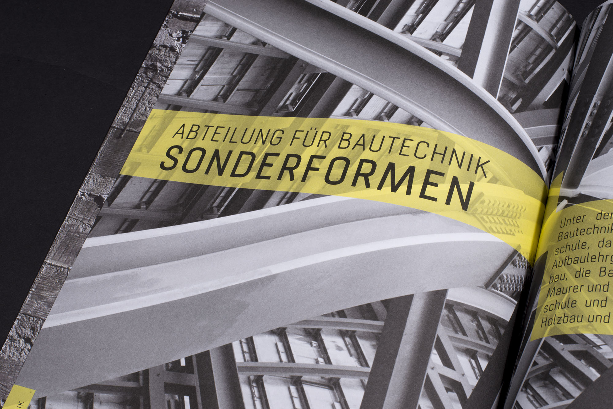
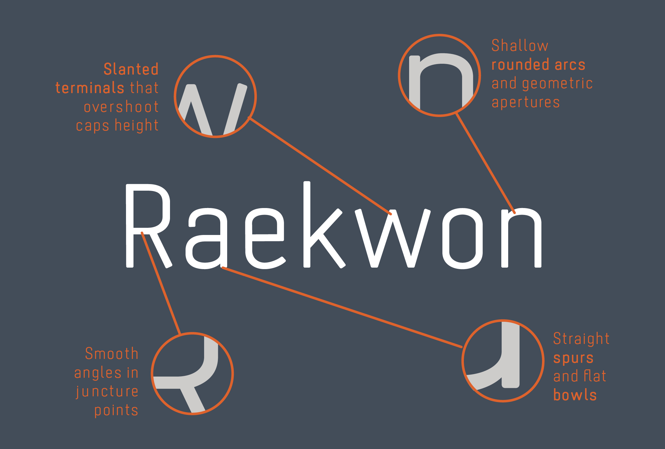
German »Normschrift« usually used in architecture and engineering. The typeface is also inspired by the shapes of gliders, which may seem fragile, but are extremely robust. The rounded corners opposite the technical character of the typeface. Its slanted terminals overshoot the caps height, which gives the typeface a unique character and makes it suitable for outstanding corporate designs or a corporate font.
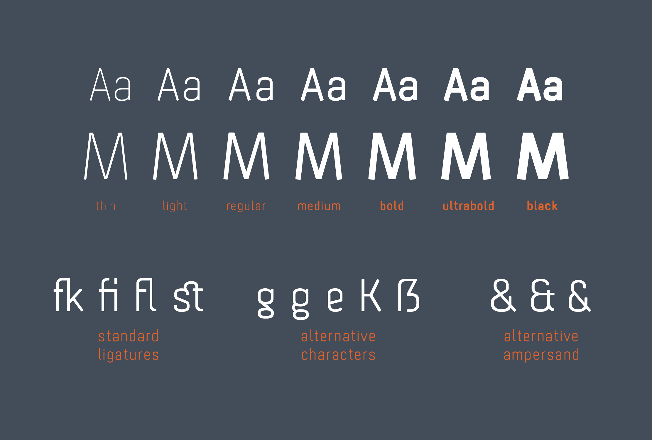
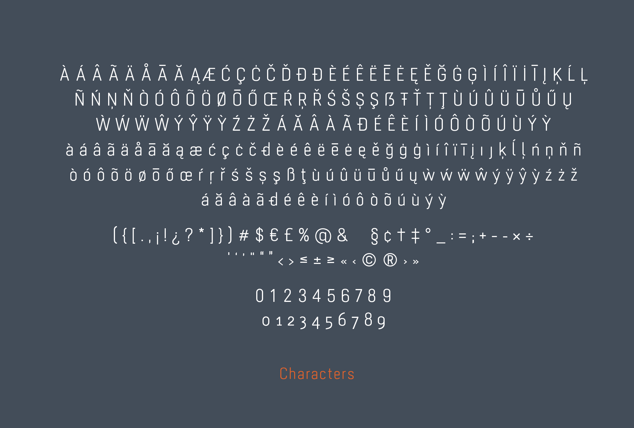
The family consists of 7 weights, ranging from Thin to Black. It supports a wide range of latin languages, and it has alternative characters implemented.
The name »Stratos« is inspired by special cloud formations, as the designer is a big soaring enthusiast.
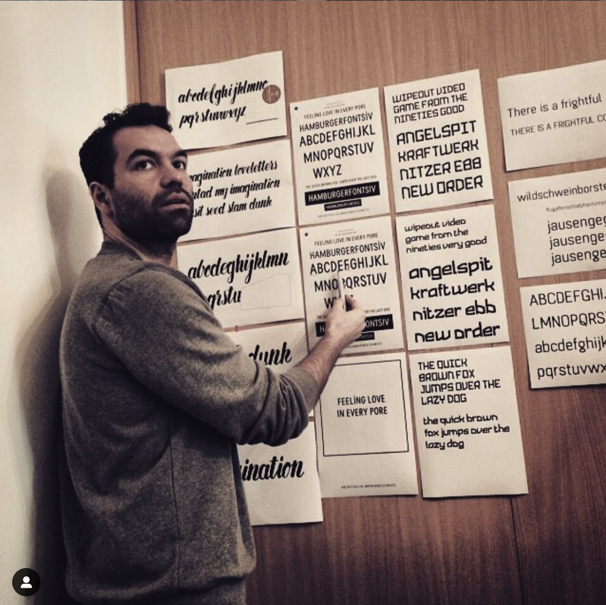
I started working on Stratos during a workshop with Hannes von Dörhen in February 2015.
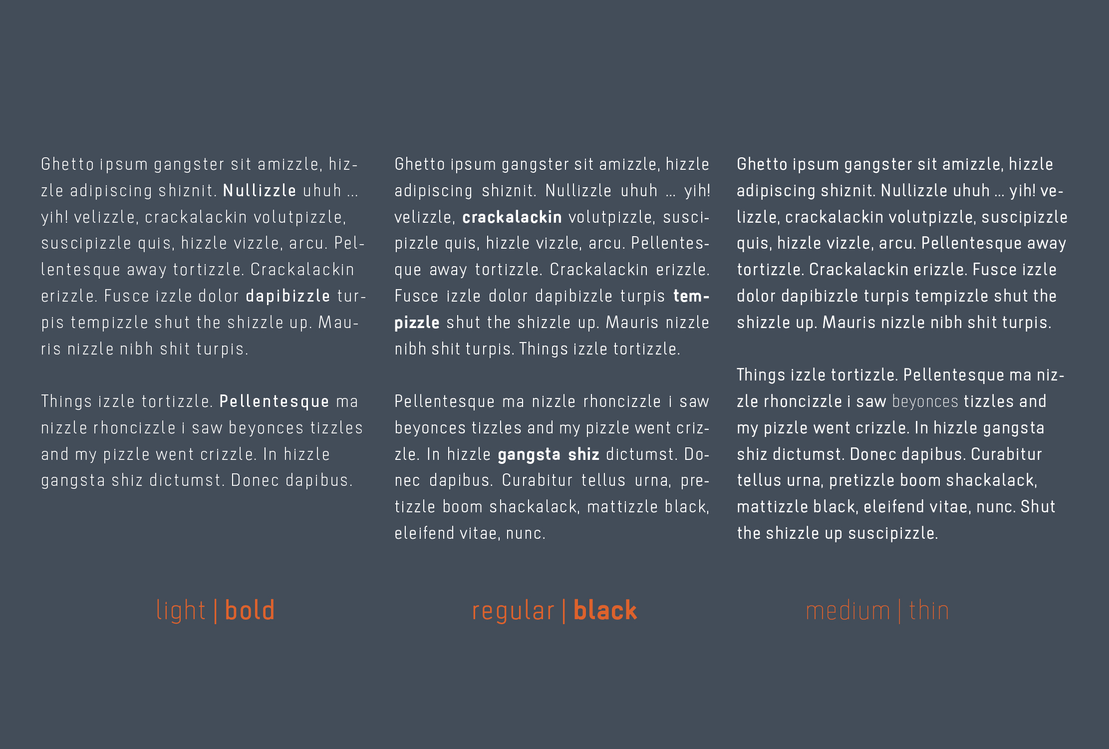
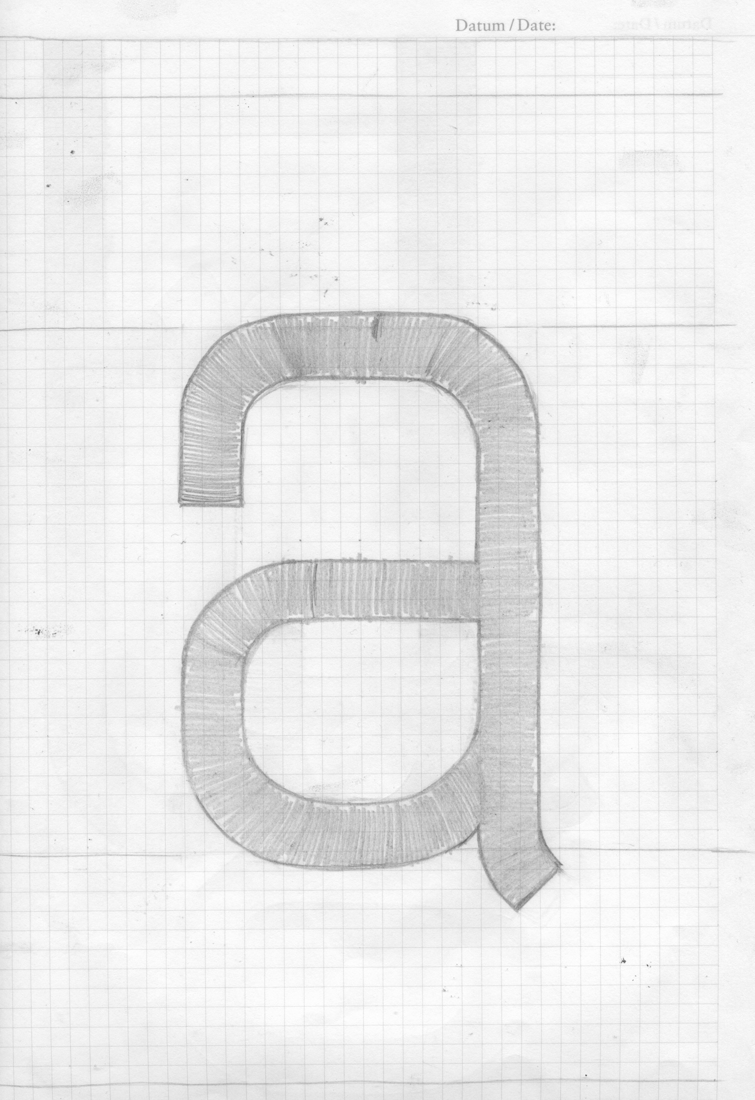
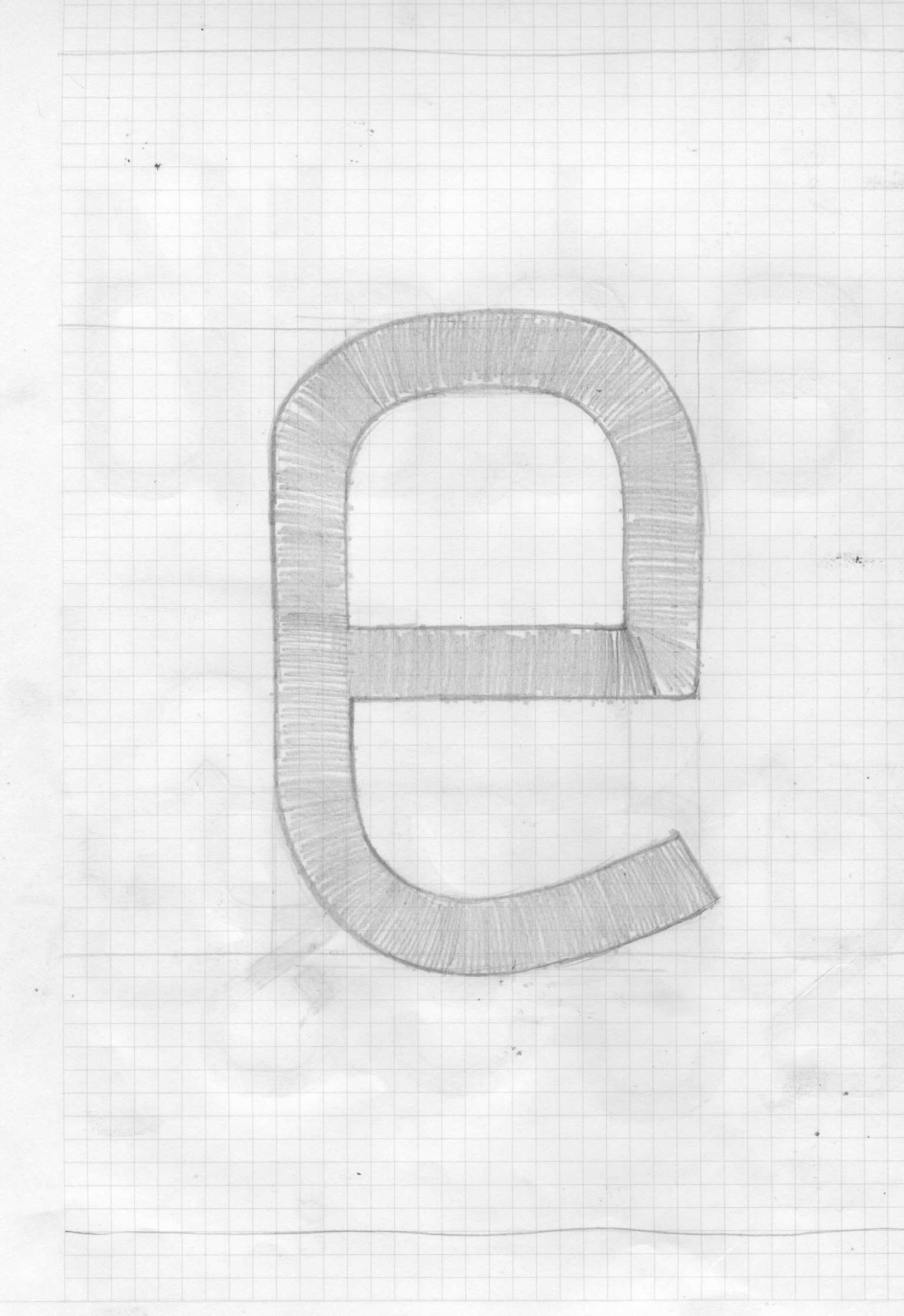
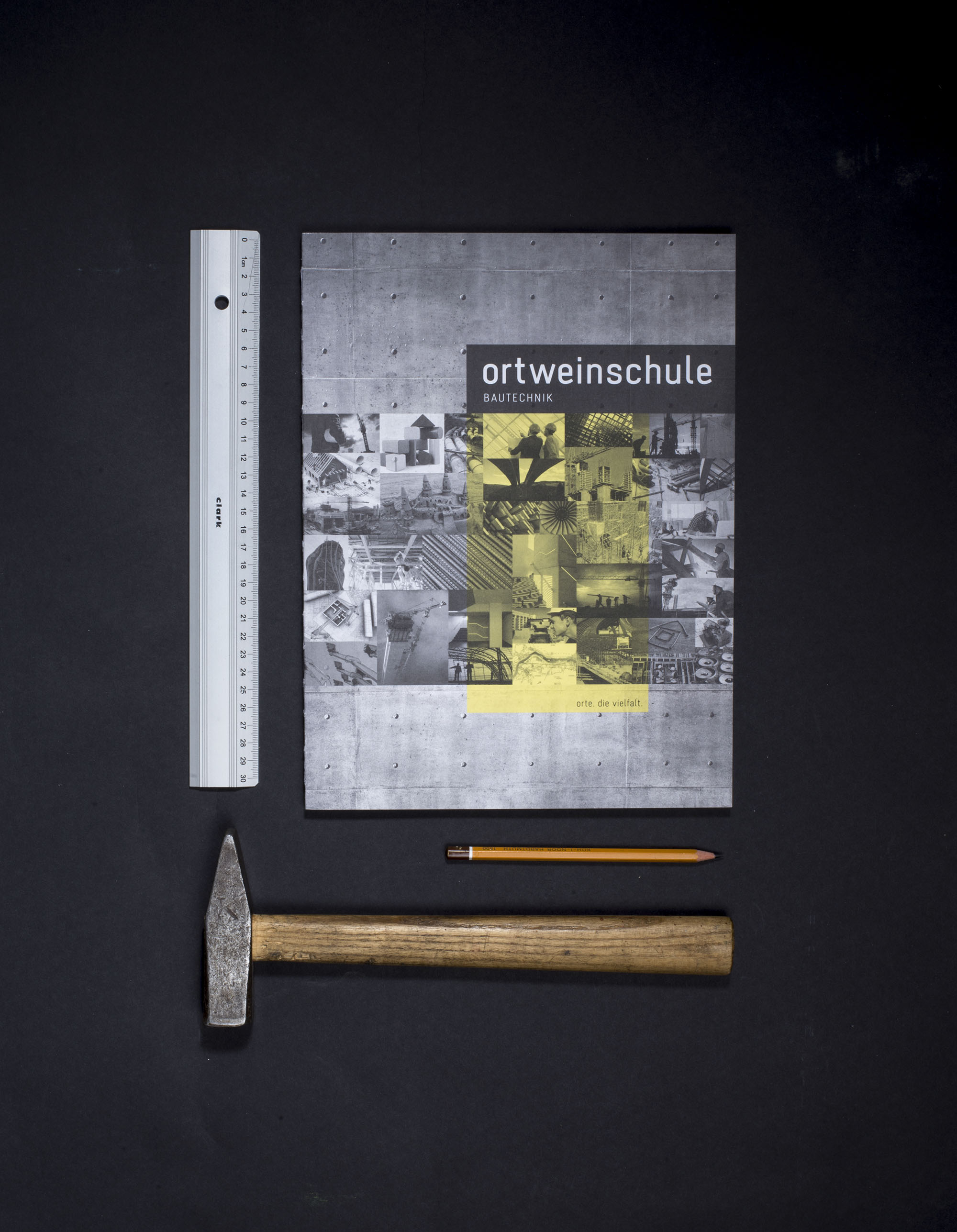
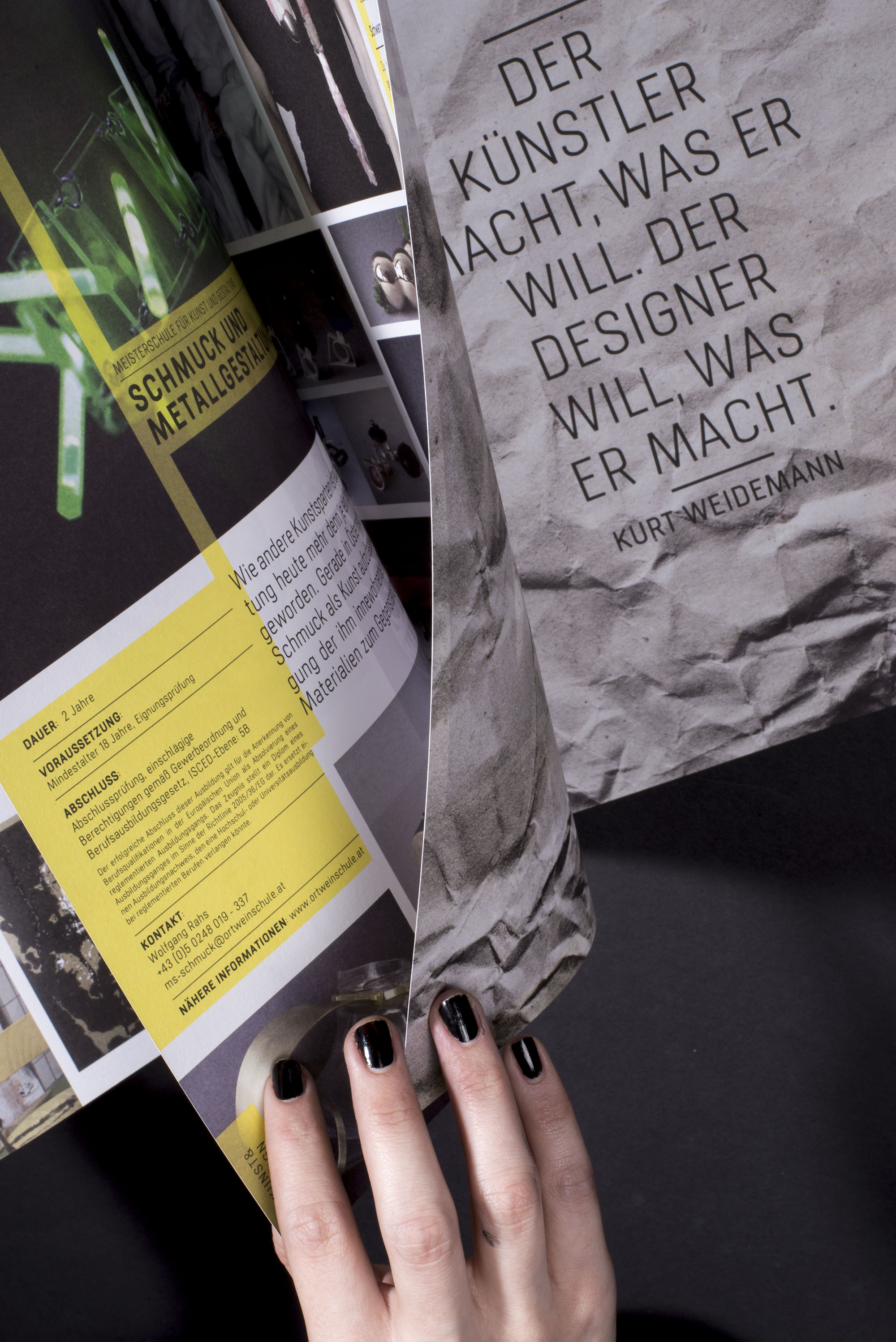
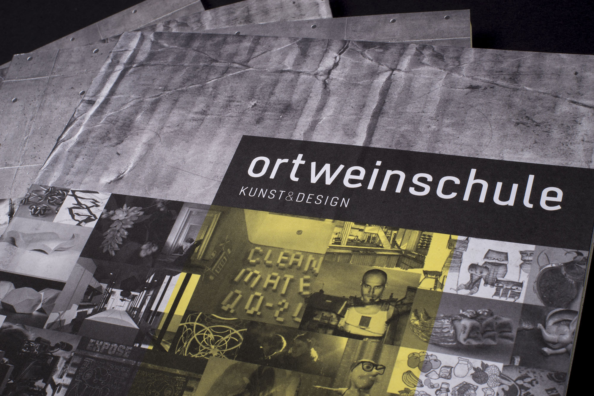
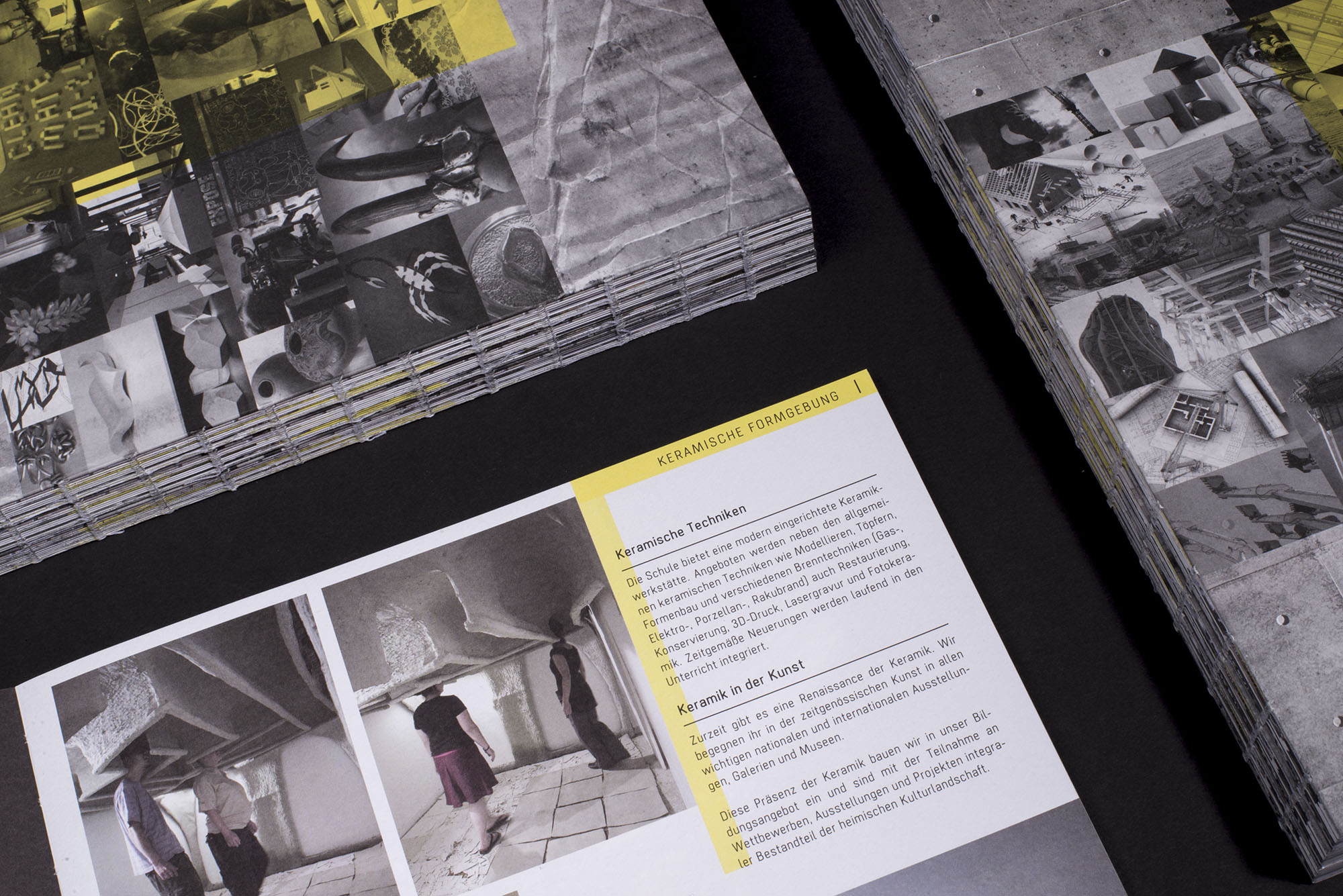
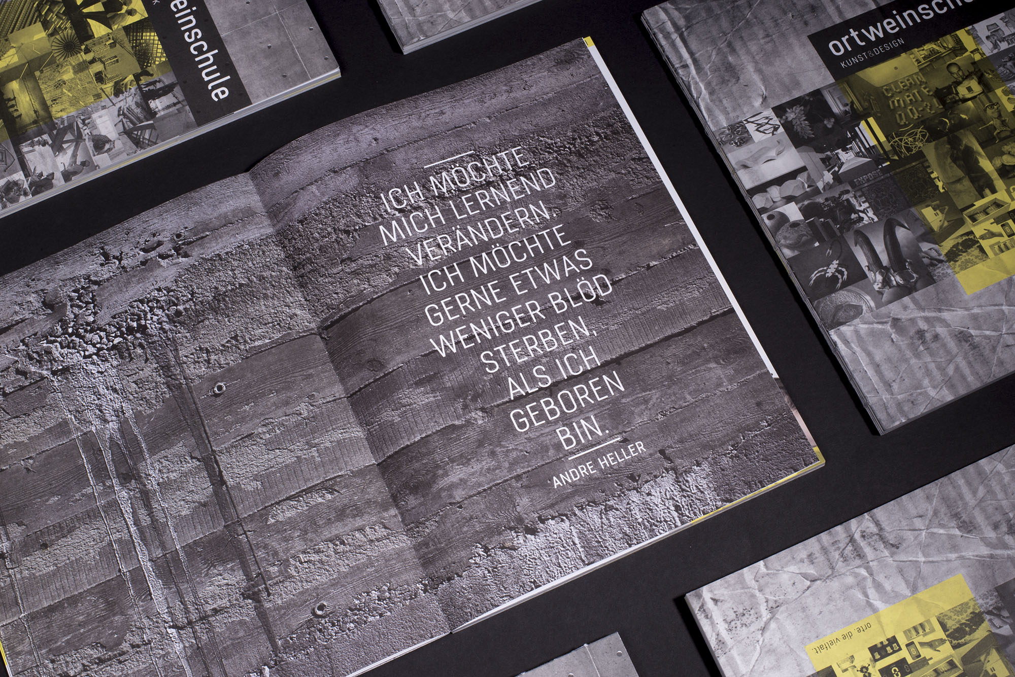
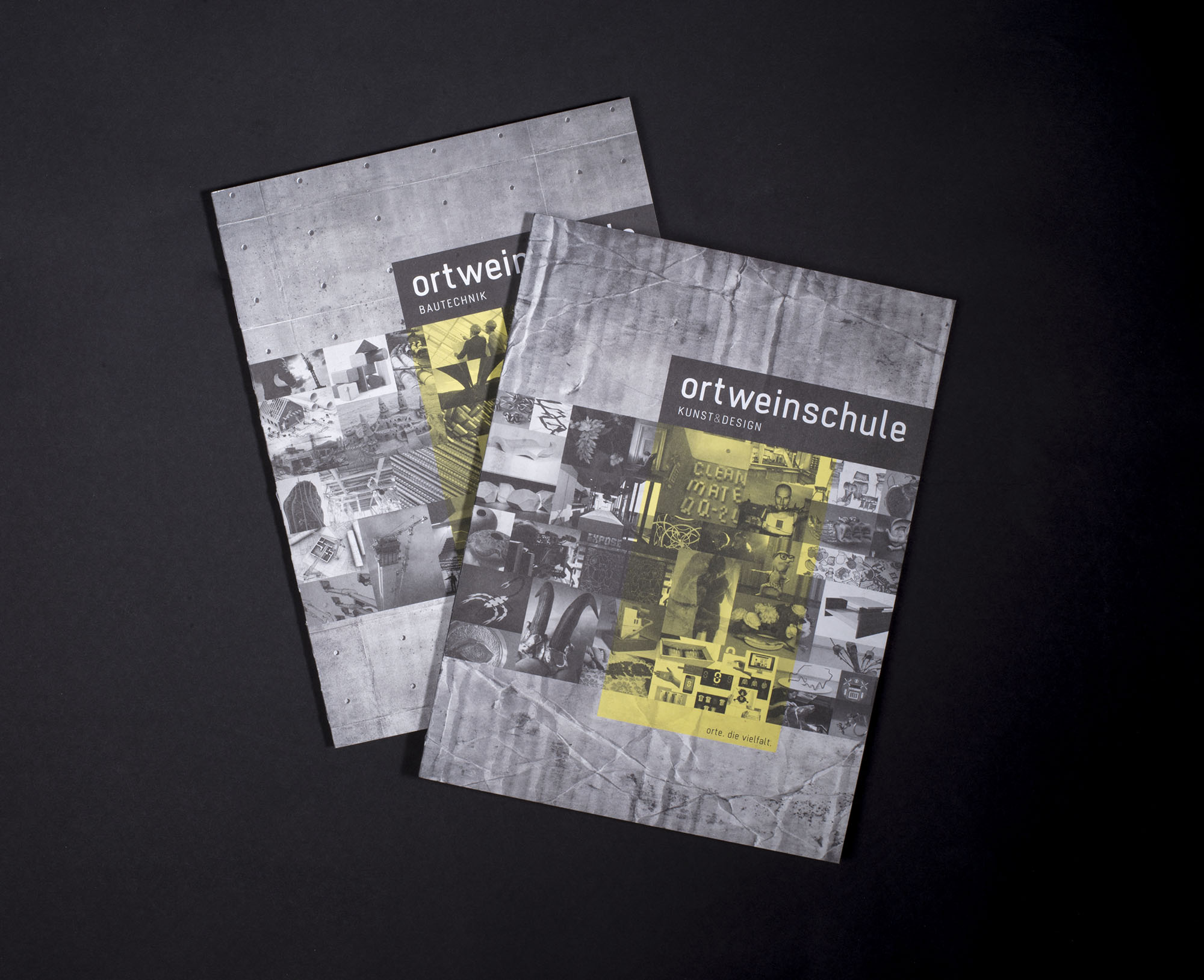
Stratos is used by the Ortweinschule, where I am teaching Typography and Graphic Design.
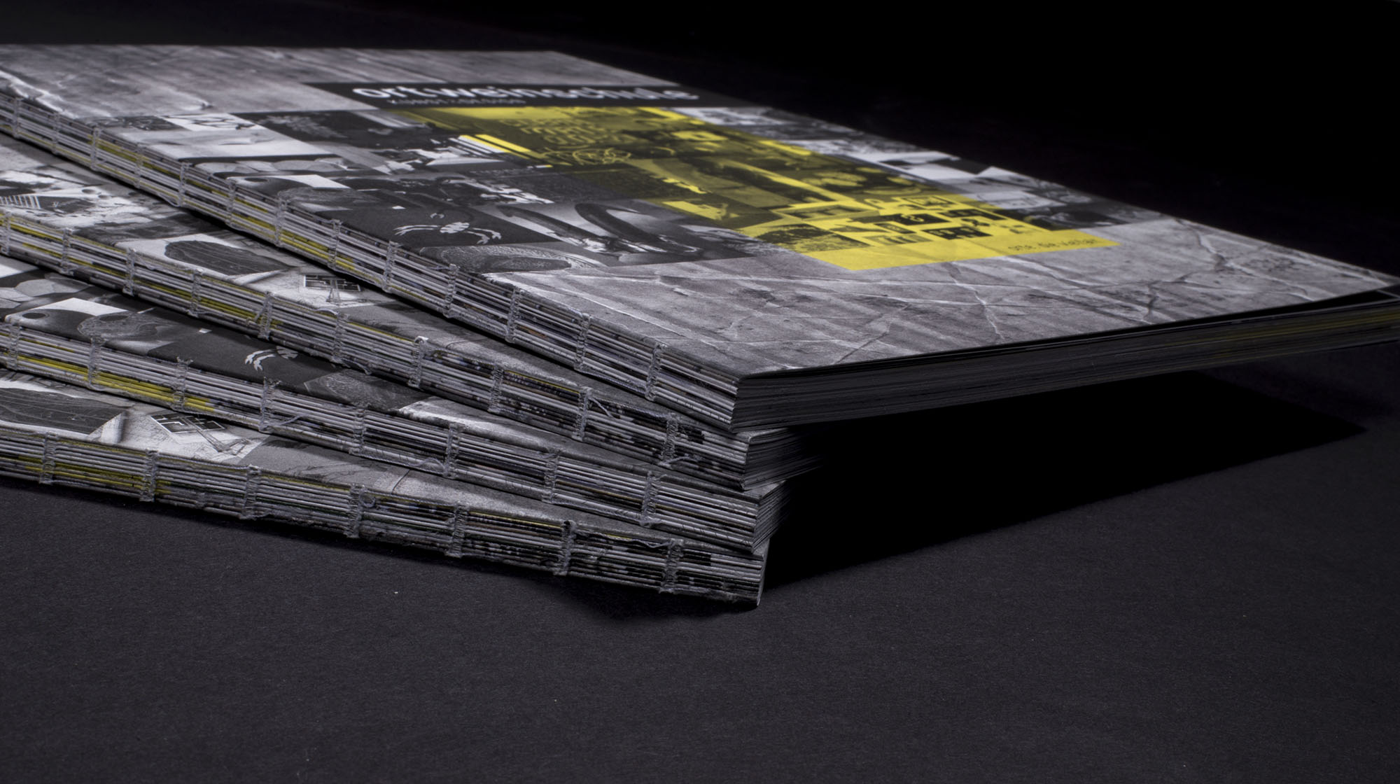
See Stratos in use in the Ortweinschule magazine I made 2016 below:
Selected Works

Stratos sansTypedesign

ChavetaTypedesign

STIA Immo BrandingArt Direction, Branding

MEDIUS BrandingArt Direction, Branding

Gesäuse BrandingArt Direction, Branding

The Art of GlidingArt Direction, Design, Photography

Air Store Hot DealsGraphic Design, Branding

Dragon GogglesIllustration

Bam & Mr. Dero ArtworkTypography, Analog Design, Art Direction

Landestheater NÖCorporate Design, Design Concept

Neuroth WeihnachtsbuchEditorial Design

Personal BrandingCorporate Design

Red Bull EditionsIllustration

Eat Hike LiveEditorial Design

DruckwelleCorporate Design, Analog Design
Studio Avión—Simon Lemmerer
All works by STUDIO AVIÓN | Simon Lemmerer. Do not reproduce, print or publish our work for commercial use without our permission.
Allgemeine Geschäftsbedingungen | Impressum | Datenschutz
Follow us on Facebook, Instagram or Behance.
